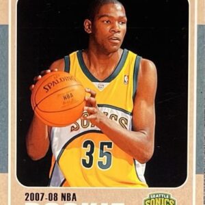
Inspiration is a curious and unpredictable muse, often appearing when least expected. For Phil Imbriano, a senior designer at Topps, it found him during his monotonous subway commute, imbuing a routine journey with a spark of creativity that would lead to the 2025 Topps Series 1 baseball card design. It began in a New York City subway car, where Imbriano’s gaze was unintentionally drawn to a red-and-silver badge tucked neatly in a corner. The badge’s sleek lines and immaculate curves left an impression so vivid that he swiftly snapped a photograph—an image that would soon ignite his artistic vision.
As the train rattled towards its next stop, perhaps it was the cadence of the tracks that guided his thoughts into form. By the time Imbriano had reached his desk at Topps, those thoughts had matured into sketches. Little did he know then, these nascent doodles would later evolve into the cornerstone design for the 2025 Topps Series 1 baseball cards, which have officially launched today.
“I find it thrilling to derive inspiration from everyday occurrences,” Imbriano explained, his enthusiasm matching the tempo of his discovery. “Anything from the architecture of a building, a captivating sign—it’s those snatches of brilliance in the mundane that often become seminal points of reference. Capturing these influences as photographs helps me revisit them later, never knowing when a humble image may swell into something significant.”
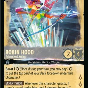
The resultant design embraces two bold lines that soar up the card’s left margin and across its top. For the astute collector, these lines might kindle memories of the 1982 Topps set, yet this time they come cleverly color-coordinated to each team, offering a unique blend of old meets new.
This nod to the ’80s wasn’t a deliberate echo. Interestingly, Imbriano’s initial muse drew from the rustic woodgrain styles prevalent in the 1962 and 1987 sets. “The serendipitous ’82 resemblance was a delightful surprise,” he chuckled. “I believe it seamlessly merges vintage charm with today’s sleek design sensibilities.”
Emerging victorious from a swathe of competing designs, Imbriano’s proposal triumphed over twenty other submissions through an exhaustive in-house review process, which Topps is renowned for. It’s a selection procedure so rigorous that vestiges of past, unchosen designs often reincarnate in subsequent editions—evidenced this year by the inclusion of a small field graphic adorning the lower-right corner, denoting the player’s position.
Imbriano’s journey from his initial subway epiphany to the final card design wasn’t a solo sprint; rather, it was a marathon fraught with iterations. “Around ten different versions were born before we pinned down the final design,” he mused. “I suspect most people aren’t aware of just how much toil and finesse precedes the moment when a new card is laid in their hands.”
The physical embodiment of these designs involves more than mere pixels; it’s an artisan’s craft. Topps proceeds to fashion tangible prototypes, scrutinizing their physical presence as keenly as their digital inception.
At the helm of this tactile endeavor is Clay Luraschi, Topps’ senior vice president of product. “When we narrow down to the final quintet of designs, we don’t just let them persist in digital form. We print them, carefully simulating the experience of opening a pack,” Luraschi noted with palpable excitement. “There’s a spirited debate that underscores this process within our office—nonetheless, it’s a labor of heritage and joy. Bearing in mind the legacy from Sy Berger’s kitchen table dreams to today’s high-tech reality, it’s an exalted responsibility filled with mirth.”
Beyond the visually arresting base design, the 2025 series heralds a trove of intriguing subsets. Whether it’s the ascendant “Future Stars,” the illustrious “Call to the Hall” honoring Hall of Fame inductees, or the “City Connect Swatch Collection Autographs,” Topps has rolled out a smorgasbord of thematic delights.
More tantalizing for dedicated Dodgers followers are the uniquely celebratory card variations, immortalizing iconic moments like Freddie Freeman’s infectious hip-swaying maneuver, fondly termed the “Freddie Dance.”
The year also witnesses the 35th-anniversary celebration of the 1990 Topps set—a heartfelt homage to the colorful flamboyance that set the era ablaze. Yet, at the heart remains Imbriano’s intoxicating base design that fuels these offerings.
Imbriano likens his card designing process to filmmaking. “Each card is akin to a movie poster,” he reflected thoughtfully. “Meant to seize attention, standing proudly in the collector’s repository like a striking mini poster.”
This collector-conscious strategy, in fact, forms the linchpin of Topps’ creative ethos. “Phil’s design has truly captivated us,” Luraschi concluded, encapsulating the sentiment. “As we gaze forward across the temporal spectrum, the hope is that people will be able to time-stamp each card in history with ease. The 2025 series undeniably fulfills this vision.”